
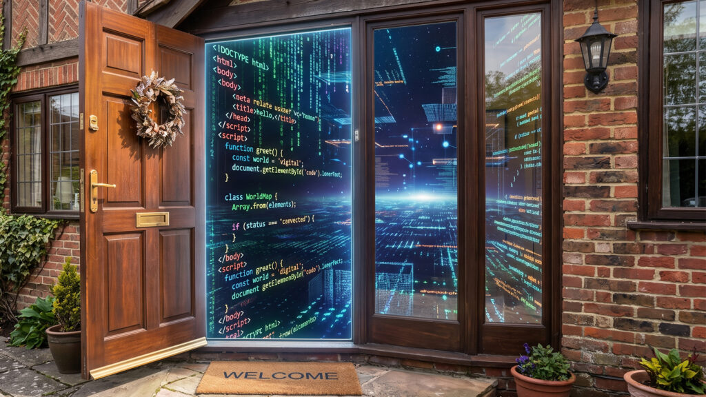
And it is making an impression before anyone reads a word
Imagine someone drives across town to visit your office for the first time. They find the door, reach for the handle, and it sticks. They wait. They jiggle it. After a few seconds, they give up, get back in the car, and go somewhere else. You never knew they came.
That happens on your website every single day.
For a donor deciding whether to give, a parent deciding whether to enroll, or a job candidate deciding whether to apply, your website is not a brochure they flip through later. It is the first room they walk into. And the research on first impressions is humbling: people form a judgment about a website in roughly 50 milliseconds, faster than a blink, and for the overwhelming majority of them, that snap judgment is based almost entirely on how the site looks and feels. Before they have read a single sentence about your mission, they have already decided something about you.
The door that sticks
The most common way a website turns people away has nothing to do with content. It is speed. More than half of visitors will abandon a page that takes longer than three seconds to load. Three seconds. That is the entire window you get, and a heavy, unoptimized site burns right through it.
We have seen this play out more than once. An organization comes to us worried that online giving is slipping, convinced the problem is their appeal, their messaging, their case for support. Then we look under the hood and find the real culprit: a donation page taking six, seven, eight seconds to load on a phone. Nothing was wrong with their story. Their door was sticking, and generous people were standing on the other side of it.
It gets more demanding from there, because most of your visitors are not at a desk. Today around two-thirds of all web traffic comes from a phone. If your site was built for a desktop and merely tolerates a phone, you are showing your worst face to your largest audience. Tiny text, buttons that are hard to tap, a menu that fights back. Each one is the door sticking, and each one sends someone quietly back to the car.
What a front-door website actually does
A website that works as a front door is not just pretty. It does a few specific jobs well, every time, on every device. When we build for organizations, these are the things we will not compromise on:
- It loads fast. Optimized images, clean code, and reliable hosting, so the door opens the instant someone reaches for it.
- It works beautifully on a phone first. Designed for the small screen as the primary experience, not squeezed down from a desktop afterthought.
- It tells your story in seconds. A visitor should understand who you are, who you serve, and why it matters before they have to scroll or think.
- It guides people somewhere. Give, apply, register, visit, contact. A front door is only useful if it leads somewhere on purpose.
- It is accessible to everyone. Readable contrast, real structure, alt text, keyboard navigation. For a mission-driven organization, leaving anyone locked out is not an option.
- It earns trust. Real photos, current information, clear contact details, and a polish that signals you are exactly as established as you say you are.
None of these is flashy on its own. A visitor will never email to say thank you for your fast load time or your logical navigation. But just like the details in a beautifully run event, they are felt as a whole. The visitor only knows that walking in was easy, that they understood you immediately, and that they trusted you enough to stay.
The quiet cost of a door that sticks
Here is the hard part. You usually cannot see this loss. The donor who bounced does not fill out a form to tell you why. The parent who left does not send feedback. The applicant who clicked away never becomes a number you can track. The cost of a sticky front door is invisible, which is exactly what makes it so easy to ignore and so expensive to leave alone.
The 60-second front door test
You do not need an audit to get a first read on your own site. You need your phone and one minute. Try this right now:
- Open your website on your phone. Did it finish loading before you finished reading this sentence? If you watched a blank screen or a spinner, so did your last hundred visitors.
- Look at the first screen without scrolling. Could a total stranger tell who you are, who you serve, and what you want them to do next?
- Try to take the action that matters most. Give, register, apply, contact. Can you reach it with one thumb, in one or two taps, without pinching or zooming?
If you hesitated on any of those, you just felt your own door stick. And you felt it under ideal conditions, as someone who already knows and loves the organization. Now imagine the experience of someone meeting you for the very first time.
Your website is working every hour of every day, whether you are watching it or not. The only question is whether it is welcoming people in or turning them away before you ever get the chance to meet them.
Let’s open the door
At Mellen Street Creative, we have been helping mission-driven organizations make strong first impressions for nearly 40 years. These days, that first impression is almost always digital, so we build websites that load fast, work everywhere, tell your story, and turn visitors into clients and supporters.
If it has been a few years, or if the 60-second test gave you pause, let’s talk. We would love to take a look at your front door with you.